I wanted to fit a continuous function to a discrete 2D distribution in R. I managed to do this by using
nls, and wanted to display the data. I discovered a nice way to compare the actual data and the fit using
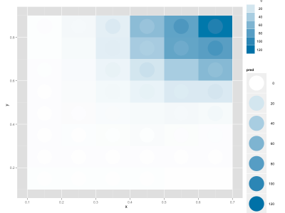
ggplot2, where the background is the real data and the circles are the fitted data (the legend is not optimal, but for a slide/figure it's probably easier to fix it in Illustrator):
 |
| A not-so-good fit |
 |
| A better fit |
My data frame includes these columns: x, y, enrichment (the real data), pred (my fitted values).


6 comments:
A contour plot is probably the more traditional way to do this...
Hi Noel, I'm not sure I understand your comment: I have essentially 2D matrix (my source data) and a continuous fit, and want to compare both. How would you plot contours here?
My bad - I read you wanted to compare two different fits to the data.
Nice--but it feels to me like maybe the circles and squares are the reverse of what's intuitive? If the outside squares represented the fit, they could vary continuously just like the fit. And the more discrete circles would be your discrete values.
Or am I missing something?
Hi David: thanks a lot for the suggestion, this is really more intuitive! I've made another post realizing it.
Wow! Even though I'll probably never use this directly it did/does an awesome job of showing what's possible. It also makes the mind stretch a little which is (almost) always good!
Post a Comment